Publication Projects
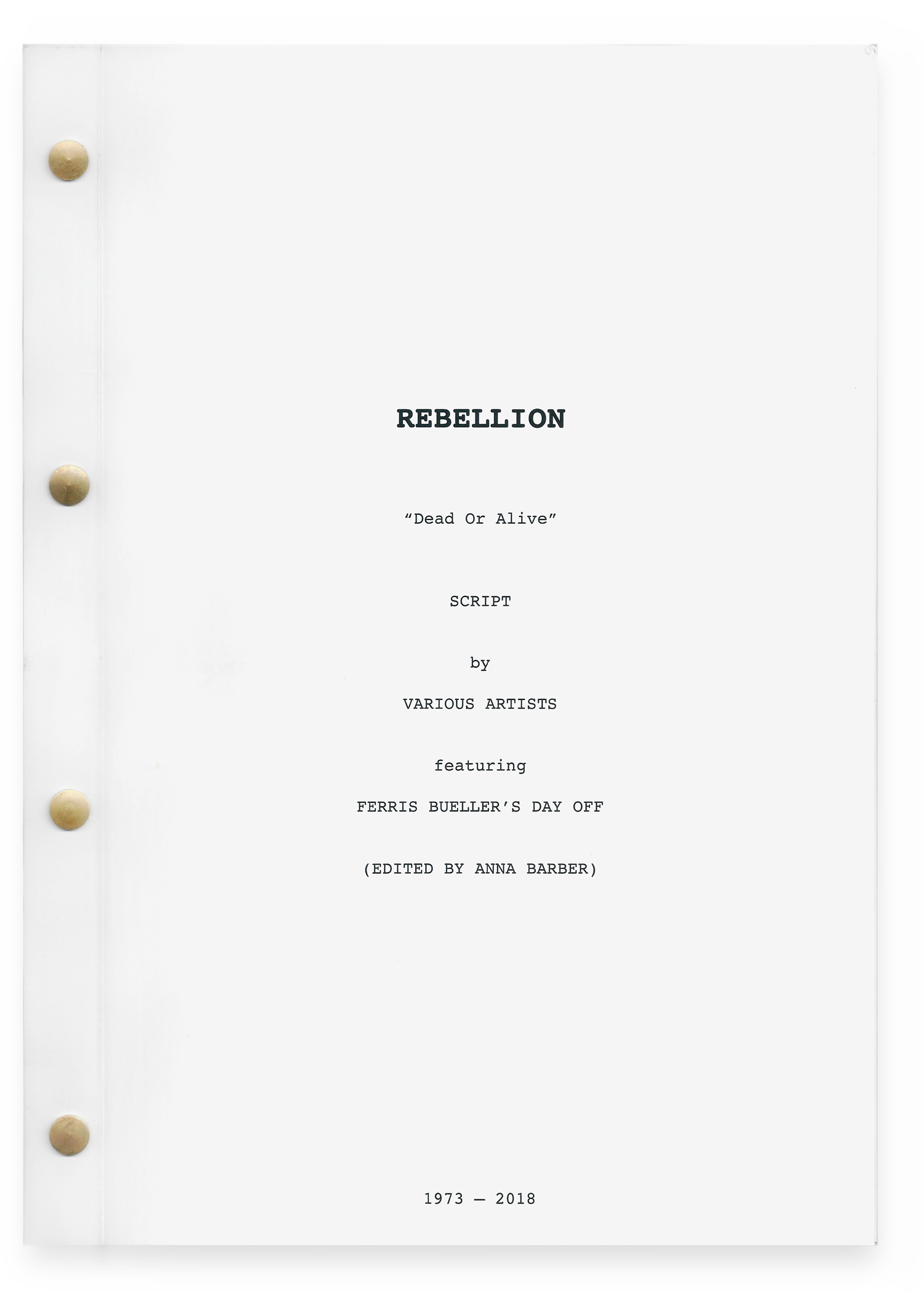
Rebellion: Dead or Alive
“Rebellion: Dead or Alive” is my Graphic Design project from my semester in London at Central Saint Martins. Students were asked to explore the following questions through a publication: “In an era when Art, Politics and Consumerism compete for our engagement, what is the relevance and role of rebellion? If rebellion is dead, what can we learn from the autopsy? If rebellion is not dead, where does it live and what is its motivation?”My project took the form of a script that uses existing characters and scenes from “Ferris Bueller’s Day Off” combined with a rewritten dialogue sourced from song lyrics. Each character is represented through a different musical artist and one of their albums dating from 1973 to 2018.
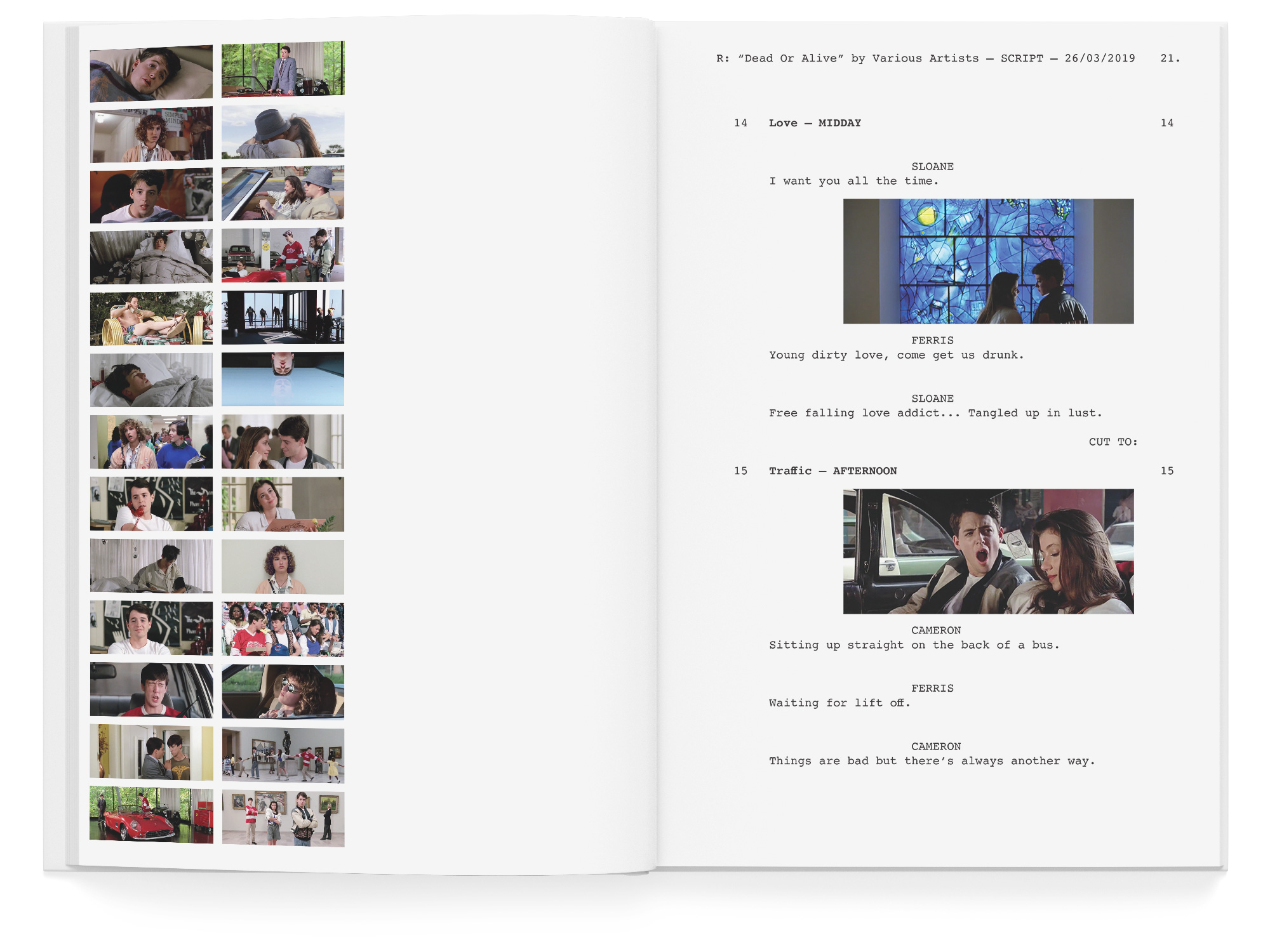
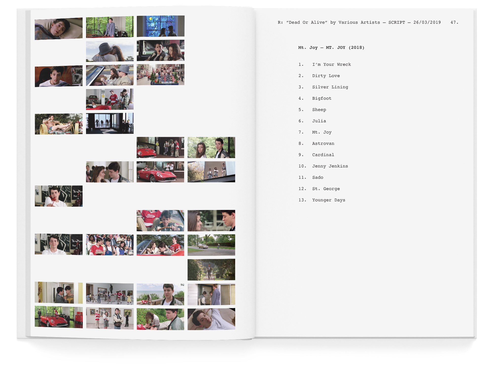
The true format of a script is apparent in the design of “Rebellion” but is occasionally ignored. Images of the film’s scenes take the place of the written descriptions of setting. Two sequences unfold simultaneously throughout the script; images of the scenes collect on the left page of the spread while the dialogue runs on the right page. Scripts are never double sided as the actors quickly read the page and flip to the next, so the dialogue is only printed on the right page.
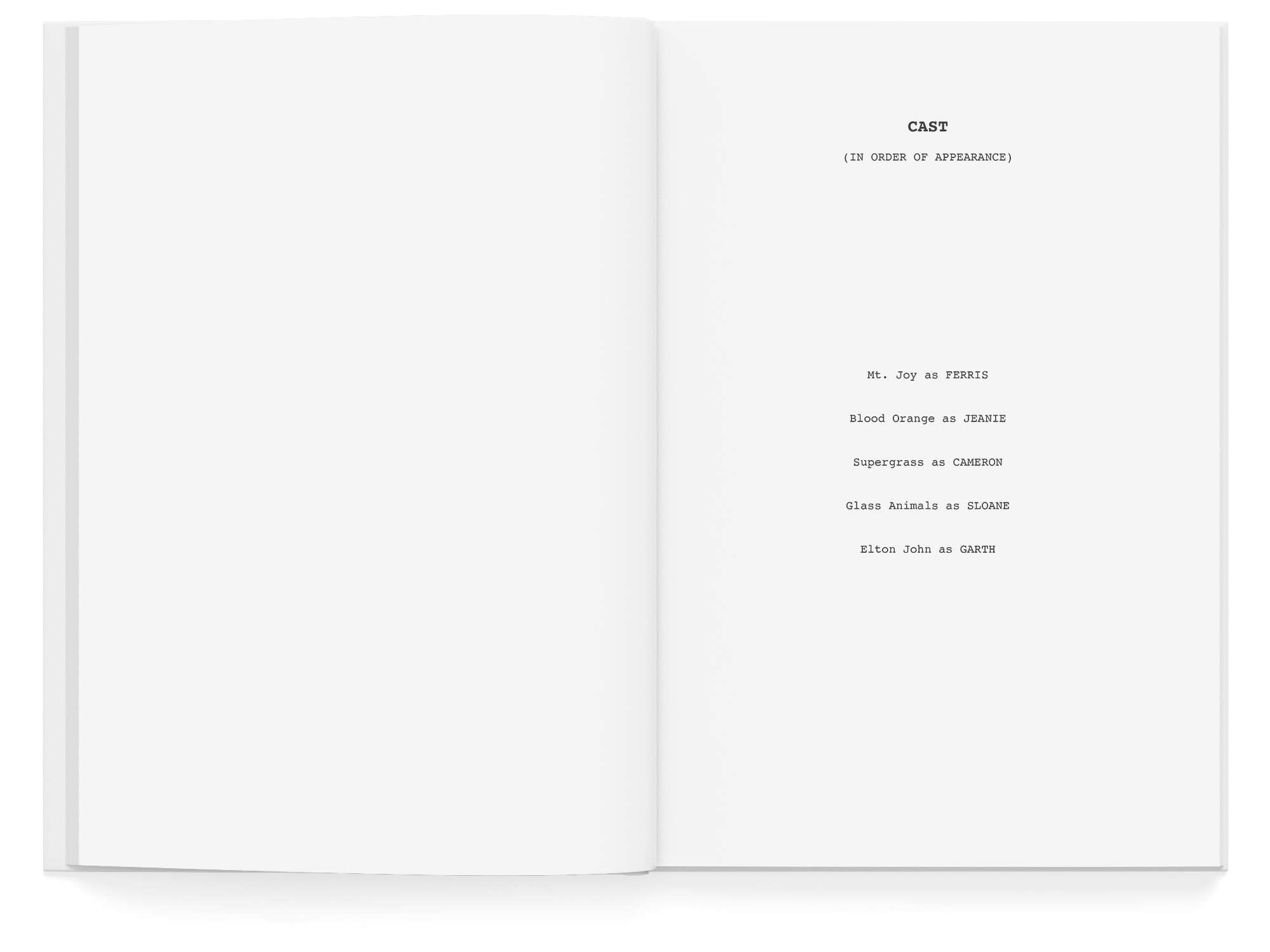
The script is inter screw bound with a sturdier cover, reflecting the classic format of a script with more reinforcement. The five characters and the albums used to create their dialogue are highlighted in the end credits, along with all of the scenes each character appears in.
It’s up to you. Is rebellion dead or alive?


Time
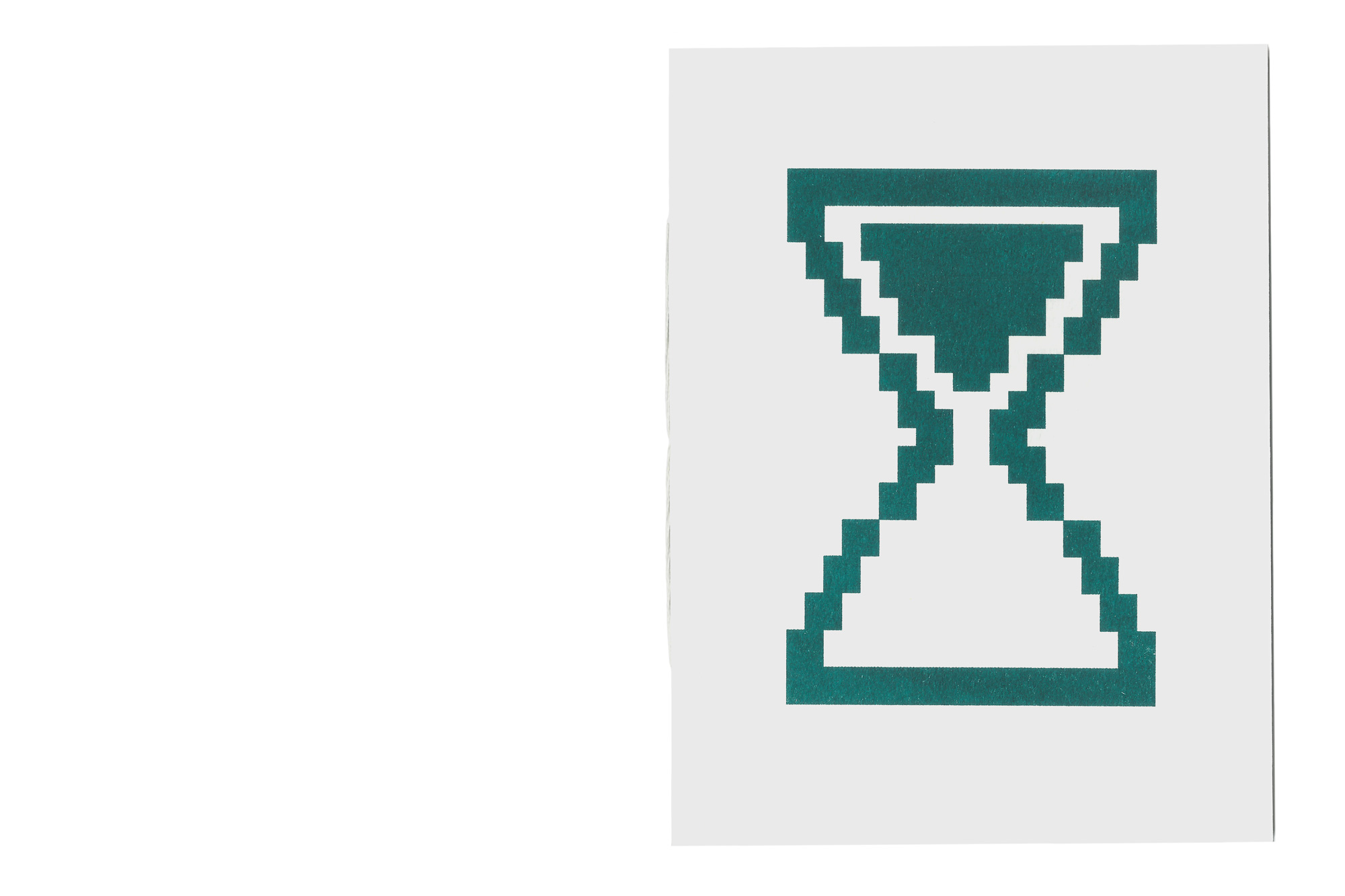
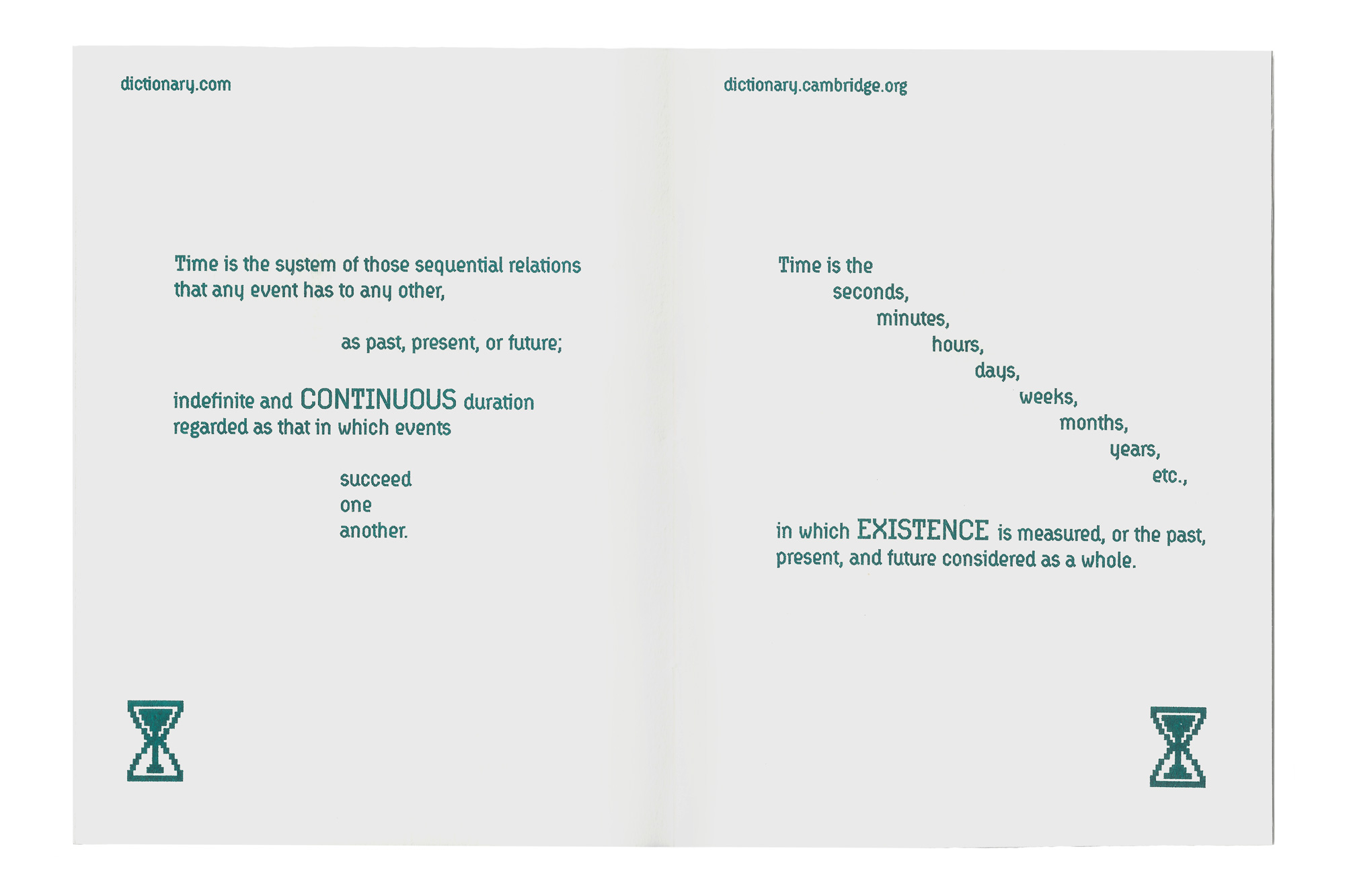
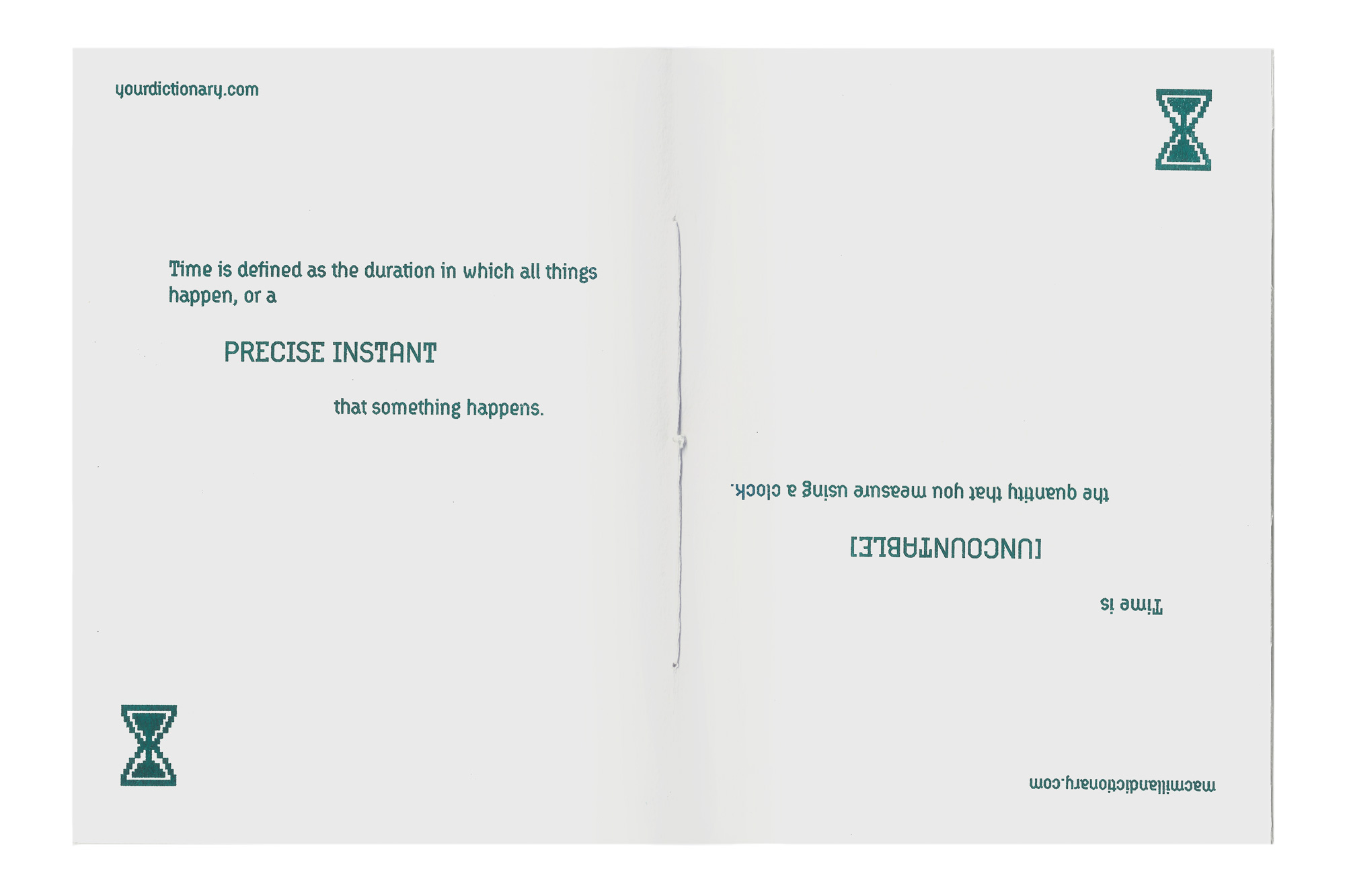
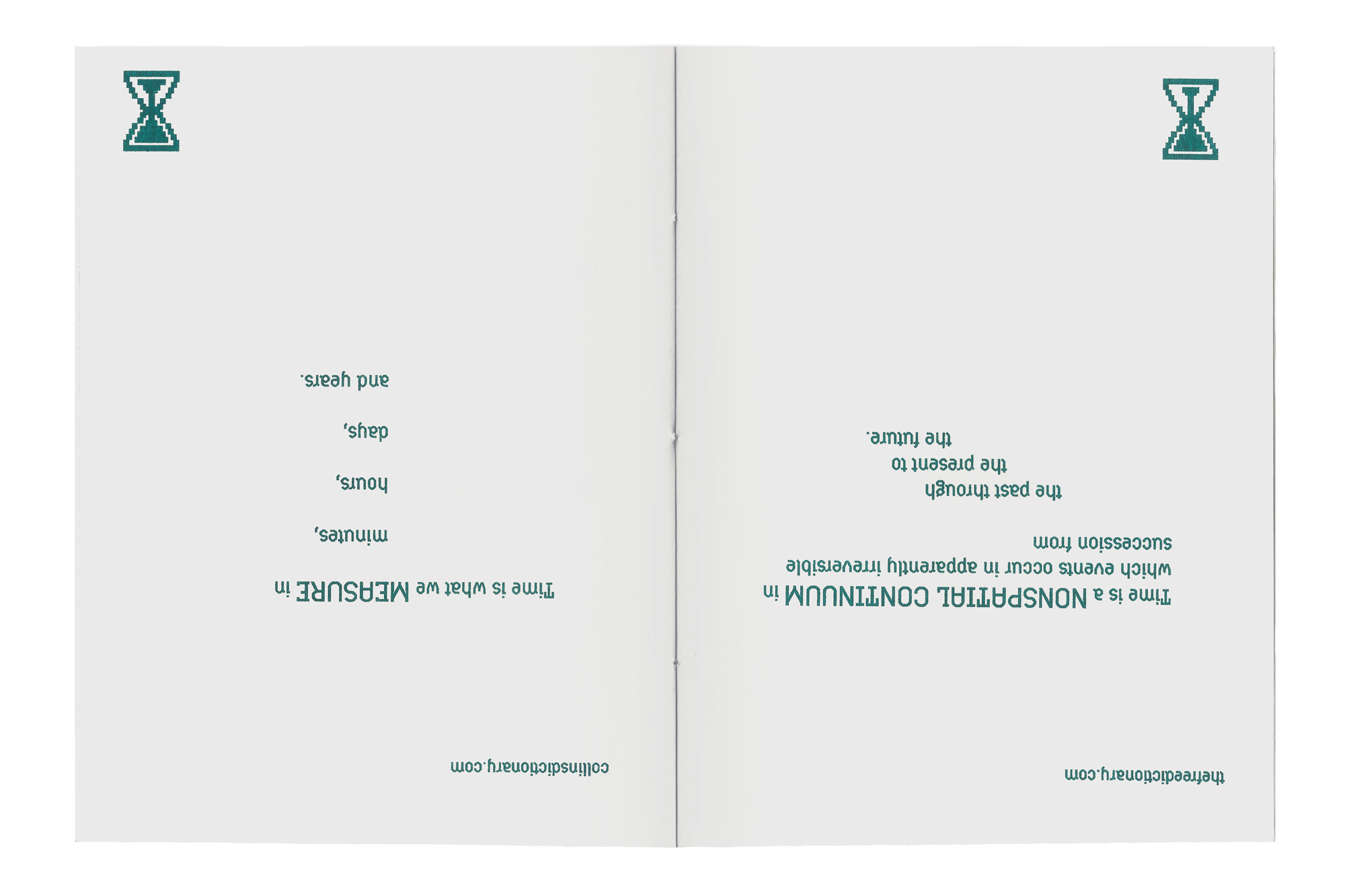
“Time” is a book I designed in my Independent Publishing course at Pratt. I was required to create a twelve-page booklet surrounding the theme of “time.” Reflecting my personal trouble with defining time, I used each page of my book to study different definitions of the concept from various dictionaries and websites. I also designed my own set of pixelated hourglass icons to use as markers rather than using page numbers. To embrace the physical form of the book, the text flips upside down, forcing the reader to turn the book halfway through, therefore flipping the hourglass so that it never ends.The final book is 5.40″ x 7.20″ and was printed on a Risograph with teal ink. The pamphlet binding was done by hand using white thread to blend into the paper, a white text stock.

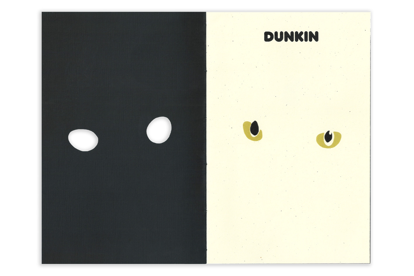


Dunkin
“Dunkin” is a book I created in my Independent Publishing course at Pratt. For this project, I was required to design and construct an eight-page, pamphlet stitched booklet with a cover, acting as a portrait of any chosen subject. Naturally, I chose to capture my cat’s playful personality through my design.The final book is 5.25″ x 8″ and contains two different types of paper. The cover is made from a black classic linen cover stock and the inside is laser-printed on matte milkweed text stock. The binding of the signature was done by hand with embroidery thread, allowing a strand to hang in the back inside cover to elevate the experience. To add to the curiosity and fun, the book includes hand cut windows to interact with the imagery.